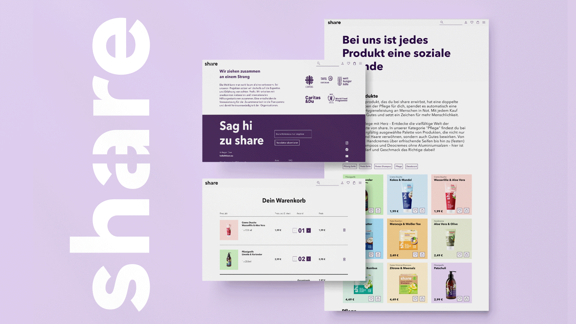

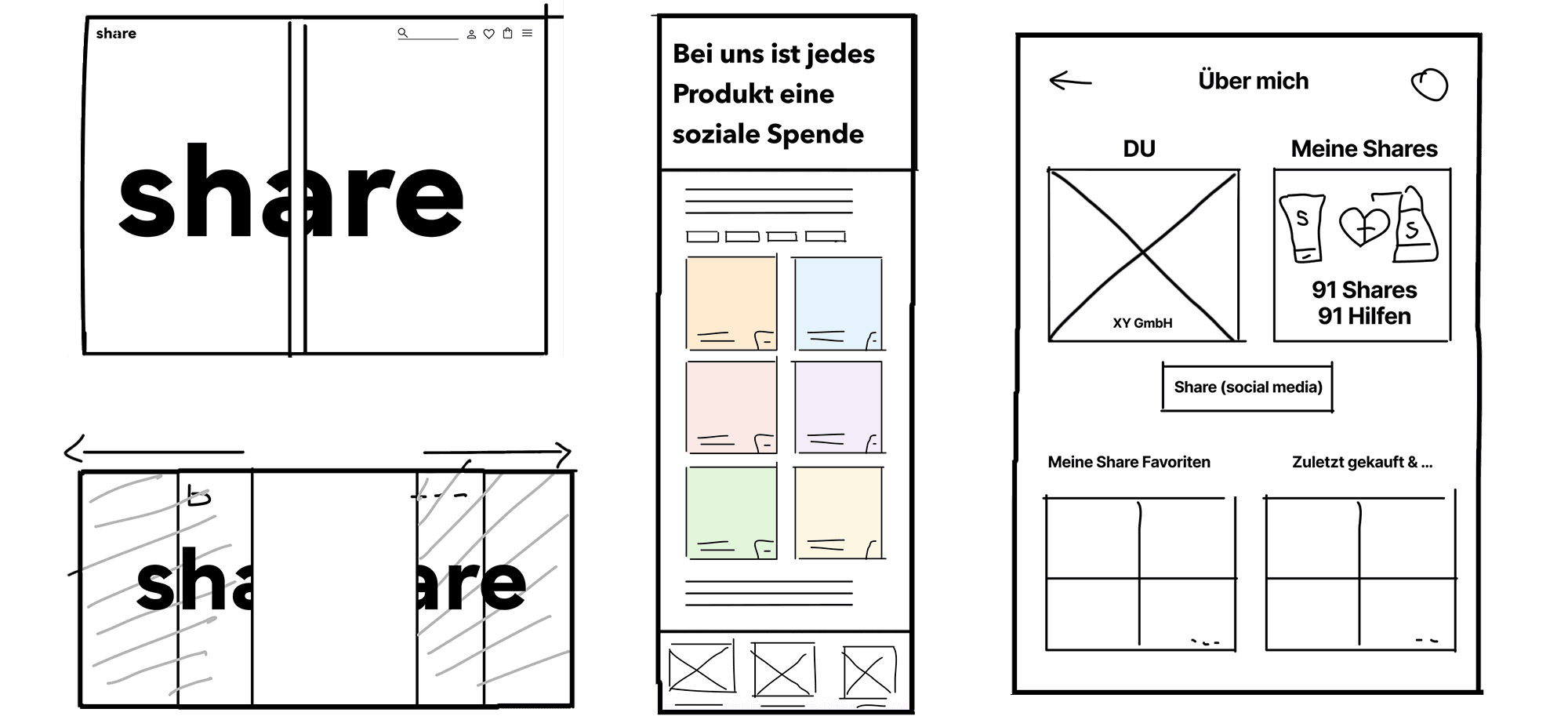

Share’s products were also reviewed from a packaging perspective. The two-part logo and tile design reflected the brand’s culture but weren’t well represented on the website. After brainstorming, a bento-box-style layout with 50/50 split elements was implemented to highlight the 1:1 impact of giving. Low-fidelity wireframes were created to document the concept, which was successfully adopted by the team.

The design was refined to keep things consistent across the site,
with the bento-box concept used throughout.
To connect with the eco-conscious younger audience, I suggested adding a feature that lets users share their engagement and “share points” on LinkedIn. This idea helps build a stronger connection with the brand while aligning with the values of the target audience.
Google Surveys
Design Thinking
Concept
Branding
Corporate Design
Low-Fidelity
User Experience
Prototype Testing
High-Fidelity
Animation